Tuesday, October 23, 2012

Josiah McElheny

Josiah McElheny is a Mcarthur Fellowship award winning artist who works primarily in glass sculpture. He learned glass blowing as an apprentice in Italy, and these glass forms make up the bulk of his work. His works speak of many things, but he primarily works with the idea of modernism as an overarching theme in his work. His work makes use of Buckminster Fuller's and Isamu Noguchi's ideas for a new type of abstraction made up of reflective forms occupying a completely reflective environment. This is a primary subject oft article "Shadow Play" but is described more succinctly in Mcelheny's Art21 segment.


“Modernity Circa 1962, Mirrored and Reflected Infinitely” (2004)

"Endlessly Repeating Twentieth Century Modernism" (2007)

Many of his works also have a cosmological theme. These works, based on the Big Bang theory, were developed with the help of an astronomer from Ohio State University. Tom McDonough, the author of "Shadow Play" gives the following explanation for these works:

"At mid-century, when the phrase 'Big Bang' was itself coined, both modernist design and science shared a kind of inhumane elegance that is the very basis on which the techno-scientific and aesthetic meet. It is this, rather than the technicalities of astrophysics, which the artist has been exploring these past five years."

The following image and link talk about the work "Island Universe". On the page that the link directs to, there is a short video of an Art21 video in which McElheny talks about the Big Bang theory and how it relates to modernism and his work. http://blog.art21.org/2008/10/15/josiah-mcelheny-at-white-cube/

"Island Universe" (2008)

In his Art21 segment, McElheny also talks about the idea that primitive societies tend to decorate, and as people become more self-conciously modern, there is a tendency to remove decoration from daily life, opting instead for purity and pure forms. It is this utopian vision that Buckminster Fuller and Isamu Noguchi imagined, and it is again

One question that I still have regarding this artist is about the idea of modernism in a contemporary setting. How can a contemporary artist refer to and praise the ideas of mid-century modernism without his work seeming antiquated and unnecessary? Indeed, McElheny's works seem fresh and insightful, despite their similarities to and direct appropriation of the works of artists like Noguchi and Brancussi. 

One answer to this question may lie in my discussion of another set of his works which talk about history and fiction, and how they are tied to objecthood. In this series of works, McElheny produced bases, were glass vases, based on dresses designed in the middle of the 20th century.

"From an Historical Anecdote about Fashion" (2000)

In this work, McElheny uses the vases to discuss the idea of history and objecthood, and how stories become transferred through these objects. As far as I can tell, he is using these modernist forms (in all of his work) not just to praise modernism as a whole, but to a vehicle to talk about those ideas of modernism which he believes may still resonate with the contemporary viewer. These ideas of placing oneself in the context of history, and using the past to come to terms with how we understand our experience in the present, seem to be central to his works. I also believe that his use of modernism does not necessarily just reference the movement, but the definition of being "modern" as a self descriptor of one who questions their place in history and the ideologies of their time.

Monday, October 22, 2012

Rockwell Kent

Rockwell Kent was a painter, illustrator and writer. He was born in 1882, the same year as contemporaries Edward Hopper and George Bellows. He died in 1971 after a prolific lifetime publishing adventure memoirs about his travels to Alaska, Ireland, Greenland and more. His travels influenced his work, which has a sense of transcendentalism and the sublime qualities of grand landscapes. However, his homeplace of New York also influenced his work, which uses the human figure in an epic, isolated way that speaks to great potential of humankind. This prophetic quality seems to be related to the time in which he lived - he came of age at the turn of the century, living through great advances in technology, two world wars, and the Depression. Kent's life spanned a time of upheaval, turmoil and change, and his work seems to take all of it into account. His grand images show his hopeful view and the glory of nature which might be humankind's salvation. Kent was commercially successful throughout his life, including through the Depression, which might explain his ability to see the potential in humanity. He also lived for most of his life on a ranch he named Asgaard (the name of the living place of the gods in Norse mythology), belying his interest in godliness and ascension, another site from which his hope might stem.


To achieve these sublime qualities, Kent uses woodcuts. This media is well suited to his subtlely stark images, because of the sharp contrast between black and white. He uses the carving to create a lot of light, as in the third image with the illuminating sun. I find his prints to be more successful for what I am interested in than his paintings, precisely because of these qualities. His paintings, in color, seem to be more interested in the beauty and transcendence in nature, and less in a sort of extreme mythological view of humanity.

Charles-Francois Daubigny


Daubigny was an established and progressive landscape painter and printmaker during the nineteenth century. While his most famous work was very traditional he also supported and experimented with the emerging impressionist style. And with this style in mind he would become prolific in etching and woodcarving. In 1851 he published his first two etchings. He approached his etchings as studies and as finished work but remarked that he viewed his etchings as a more widely accessible commodity rather than made for a specific audience.


 In this etching, "Stags By the Waterside" he employed a cloth texturing to create value. Then he went over it again and added line. His line is characterized as vigorous and unpretentious enabling him to float down a river on his boat and capture a moment of nature's beauty quickly. He has many more whimsical sketched vignettes of his boat travels made from 1861-1862

 
This is one of his most famous etchings entitled "Tree with Crows."  This etching marked a change in the way he viewed printmaking. This piece is much more finished and purposeful. His impressionistic line work on the ground is mirrored in the trees and in the crows as they all merge together. His work was influential because he was embracing the impressionism into his style which made his work more dynamic and his line stronger.


Mark Bradford


            Mark Bradford is an African American artist from Los Angeles, born in 1961.  His works are historical and political, and he generally works in massive paintings/collages made from collected printed matter from the streets.  His work strikes a balance between microscopic and macroscopic.  The canvases are turned into what appear to be birds-eye views of big chaotic cityscapes, but when you approach them close-up you’ll see that imagery from newspapers and magazines have been used.
            His piece, Kingdom Day, commemorates the ideals of the annual parade, called Kingdom Day, in Los Angeles in honor of Martin Luther King Jr., yet he uses publications that were printed about the beating of Rodney King, which took place in the same location as the start of the parade.

            Kingdom Day 2010
                       
Kingdom Day detail

            Categorized as a history painter, Bradford’s work is often compared to that of Gerhardt Richter, however there is an important, quite oppositional, concept behind Bradford’s work that departs from Richters; instead of addressing a historical subject and creating from it an emblematic image from that one isolated source, Bradford amasses physical representations of the layered complexities of a certain subject and then condenses them into one image.
            He once described his work saying, “in a lot of my work, I try to lay social information on top of the modernist grid, and shake them up to produce a hybrid image of the two.”


Kryptonite 2006

            I really appreciate Bradford’s work for the amount of risk he takes and the boldness with which he mixed media and method to produce such dense imagery.

Sunday, October 21, 2012

Helen Frankenthaler

Helen Fankenthaler (1928-2011) was a New York based artist who entered the art world through her paintings, but today her prints rival her paintings and arguably surpass them. She was a part of the abstract expressionists in the 50s and 60s in New York. There is a major arch in Frankenthaler's prints. Her early prints battled with the process. She is quoted saying, "I was very suspicious and full of questions, and felt that printmaking did not hold for me as something that was part of my involvement in the avant-garde... And the whole idea of it: you put this down in black, and then you mix whatever color you want it in, and you can put down more than one color, and you do it in stages... I was used to doing things all at once, and I had to learn that printmaking cannot be done impatiently if its to be dome well" (quoted in Krens, 23)

Fist stone, 1961 Lithograph in 5 colors

Frankenthaler's usual spontaneous painterly way of working was difficult to translate into printmaking. To resolve this problem, she would make a mark through a stone or etching, proof it, cut it up and then fiddle with the different pieces until she found a composition she was happy with. I think her more interesting work emerged when she embraced the printmaking process. When she moved to working with woodcuts, it was impossible to compose prints in her cut and arrange method. Instead, she used a jigsaw to break up the block and began experimenting with composition in this manner.  

East and Beyond, 1973 woodcut in 8 colors

She increasingly balanced her work between experimental and laborious. She worked with the master printer Kenneth Tyler to create complicated and unique prints which moved away from the hard edges found in her jigsaw woodblocks.

In an essay about her printmaking experience she wrote, "I want to draw my own images, mix my own colors, approve of registration marks, select paper- all the considerations and reconsiderations. Assuming that those who work in the workshops are all artists at what they do, I can then entrust the actual duplicating process to other hands that possess-hopefully-their kind of magic. Sharing and participating to the end." Frankenthaler's words reveal her relationship with the printmaker, but also her hugely increased confidence in the medium, especially when compared to her earlier concerns and awkwardness handling the mark making and process. 

Freefall, 1993 woodcut and stencil

Madame Butterfly, 2000 woodcut in 102 colors


Charline von Heyl is a contemporary German painter born in 1960. Her development as an artist was contextually situated in a period dominated by figural painting.  She also encountered the response – a very male dominated discourse that took an ironic, critical stance against these late modernist trends.  Of course, that environment has greatly impacted her work.  Instead making paintings that are either “nostalgic for modernism or satisfied with reiterating painting’s death” she endeavors to create an image that has “not yet been seen and cannot be named.” 
Von Heyl’s work is also nonlinear: perhaps as a response to late modernism’s tendency towards serial production and consistency.  Each painting is distinct from the last; it has even been described as anti-institutional in the way that she resists making a signature product or developing a “branding.”
Her work is both disorienting and consuming; the paintings have a kind of endless depth. Using a wide variety of materials to create intense colors and contradicting shapes, she successfully manipulates the viewer’s perception of space.  She her “almost-identifiable” forms seem to refuse to be still.  And, certainly, there is a simultaneous experience of attraction and repulsion that one gets from these undulating, multi-layered images.  Her work is certainly something you can get lost in. 
For me, her most successful work is Igitur (2008).  It seems as though she has exposed inside of something, and it is both intimate and beautiful.  In this work, she is perhaps responding to our patriarchal society’s favoring of a controlled outward appearance.  As opposed to self-restraint or censorship, she uncovers what appear to be the inside of this bizarre, unrecognizable figure.  Her use of symbols and signs without direct reference has also been identified as a “risky and distinctly feminine act”.  Of course, it is because of this interpretation (and the gorgeous colors) that makes this work particularly exciting for me.
I would love to see these paintings even larger-- mural size.  In the way that they create a kind of all-consuming and spatially confusing experience, I think these paintings could really do something extraordinary when situated in a real space.  Working on existing architecture could enhance her already fascinating play with our perceptions of dimensions.

emil nolde

Emil Nolde was a German painter and printmaker who was one of the first Expressionists, involved with "The Bridge" expressionist group and Kandinsky's Blue Riders. He grew up on a farm but then studied to be an illustrator/woodcarver. He supported the Nazi Party, although the regime labeled his art as "degenerate" and he was banned from making art.

Of his prints, he is most known for his lithographs and woodcuts, which are carved with an aggressive, expressive cut. The "Print" tome says Nolde collected tribal art, which influenced his raw carving style, mimicking "primitivism", and the expressive depiction of the female nudes was supposed to "give form to the triumphant creative will of the male avant-garde artist by equating it with a conquering virility" which pretty much sucks. 

Nolde's carving method is successful in creating an expressionist brushstroke, and the often visible woodgrain adds to the emotion depicted. He uses woodcutting/printmaking as a medium and uses visible "errors" such as not inking as much in certain areas, and embossing the paper deeply to vary the surface. 


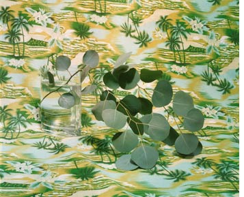
Annette Kelm


Annette Kelm was born in Stuttgart, Germany in 1975. She studied in Hamburg and currently lives and works in Berlin making photo-based work. Her images are carefully lit and composed, than captured with analogue cameras. They fall into the standard categories of still life, portraiture, and landscape. However, the images themselves are not conventional. Frieze magazine points out that “As self-evident as her images appear, they are undercut with a strangeness that questions not only the purpose of the objects, but also the nature of their representation.” She comments on the history of photography and its place within the art canon as well as its ability to filter imagery.


In this image, titled Your House is My Castle (2005) the artist, wearing a false beard, is looking out from the window of a slanted building. The image recalls classical motifs with the depiction of beautiful countryside and architecture- however Kelm adds that hint of strangeness that throws the image off balance. 


This image, After Lunch Trying to Build Railway Ties (2005), is a good example of her peculiar still life set ups.


This untitled series of images (2007) is the most interesting work to me. The woman, dressed in all black, is photographed in front of a solid blue background. Her face is obscured by a hat. It is impossible to get much information about the woman, because of the neutrality of the photographs. Each image is framed in the exact same way, and the only changes between images show the movement of the head. According to the article "Twisting and Turning" by Beatrix Ruf, published in Parkett, "As in other series, we look at the pictures so long and so intently until the act of looking itself becomes the context." The repetition of an image is a method that Kelm often uses in her work. This causes the viewer to have to search out the differences between the images. She addresses photography's portrayal of time- she shows it passing but also being arrested by the still frame. 
I think this is her strongest work because of the way that it forces the viewer to closely observe the images. 


Henri de Toulouse-Lautrec

-->
Henri de Toulouse-Lautrec was born in France in 1864 and went on to become one of the most influential illustrators and printers of his time.  His most well-known and successful work centers on the decadent life of urban Paris.  Lautrec was especially drawn to the theater district of Monmartre where the most famous cabaret performers played, and artists, writers, and philosophers came to live.  During the time when his work was most prolific, in the late 1890s, Lautrec was living in a post-impressionist Europe, swamped by an overwhelming atmosphere of indulgence in alcohol and sordid entertainment.  Richard Thomson calls it a “means to represent a complex, fluctuating scene, chic and seedy, corrupt and commercial, subtle and gross”(508). His ability to capture this feeling is his most successful quality as an artist.
http://judaica-art.com/images/uploads/Lautrec/Henri%20de%20Toulouse-Lautrec%20-%20Ambassadeurs_%20Aristide%20Bruant%20dans%20son%20cabaret-border.jpg
Ambassadeurs: Aristide Bruant dans son cabaret 1892
Lautrec manages to display the eccentricity of personality with sparing, energetic lines that show the influence of master drawers like Degas, and utilizes traits of Japanese prints like large, flat color areas, and oblique points of view in his advertising posters for celebrities like Jane Avril and Aristide Bruant. His talent for abstraction offers a seductive, yet innocent glimpse into Parisian nightlife that played on popular fad and intrigue of the urban lifestyle.  Other successful strategies in Lautrec’s work are his process of sketching performers in their own surroundings, building a bond of familiarity for their unique characters, employing free-form lettering for clear direction of information, and using a tone of decorative unity that suits his medium of two dimensional color lithography.  I think Lautrec’s least successful work is his paintings, because although they retain his linear style of working, his line quality is at its most expressive and powerful in his prints due to its economy and harmony with the flat use of color and compositional abstraction. 
https://blogger.googleusercontent.com/img/b/R29vZ2xl/AVvXsEhtSKBWgGNNkUHgVbvI9_abJQq6pKfHXqXqlBSl6XG1CN0yeDjdHvtRFiSwbiQ40gzEiOD-SZIF6UQk-qJcRCrsuZoQHdRgWqm49sB79LWUVIqNxZBDQpi9v7C0ioU7g1gQycabBqVXBB4/s1600/300px-jane_avril_by_toulouse-lautrec.jpeg
Jane Avril 1893

Robert Indiana


Not a typical print in The Print in the Western World, Robert Indiana's LOVE etching and aquatint (1991) grabbed my eye (above).  Interestingly, the LOVE series began as an image for a MoMA holiday card in 1958, but its' popularity led to the production of post-stamps (below), silkscreens, aquatint etchings, and the well-known sculptures.


Robert Indiana, born Robert Clark, adopted the last name Indiana to strengthen  his identity to the midwest.  His text work is inspired by road and establishment signs that break up the characteristically flat midwestern landscape, and he uses his text to do the same in societies' flat habits.  Best illustrated by the post-stamps and city sculptures, the bright colors and bold letters of the word LOVE interrupt a passerby.  Robert Indiana also made work where EAT and DIE were paired together, but interestingly, the optimistic words such as LOVE, HUG, and HOPE have been more successful.  Other works such as painting the letter "M" on the Milwaukee Bucks basketball court and the Taipei 1011-0 (below) brightly colored numbers also insert text into routine like signs, but I find them to be less successful because they seem disconnected.


The optimism, simplicity, and ubiquity of LOVE create a positive, globally connected feeling.  It seems that Indiana has caught onto this, as demonstrated by his HOPE fundraising for the Obama campaign and his Peace Paintings after 9/11.  From a printmaking perspective, I find two things very intriguing: 1) LOVE began as a holiday card and transitioned from digital to traditional as well as cheesy to fine art.  But I wonder- were the silkscreens and aquatint etchings necessary?  I don't think so- what's the point?  Is not it successful as a card or post-stamp?  2) LOVE is a printerly sculpture by its' ability and encouragement to be reproduced.  How do relate printmaking to the sculptural object?


Wednesday, October 17, 2012

Katharina Fritsch: A Sense of the Uncanny


Katharina Fritsch is a contemporary German artist famous for her large-scale polyester sculptures. At first glance, her subject matter seems eclectic— even random— but a closer look at Fritsch's artistic process and conceptual ideas reveals that her work is actually highly focused. For one thing, the idea of clichéd and popular imagery seems to underly all of her pieces. In several of her early works, she depicts a human skull as it is typically represented in anatomical studies, halloween decorations and punk regalia. As you can see below, Fritsch experimented with presenting the same basic skull form from slightly different angles, or with different accents (like the hat). The repetition of the skull in all three works begins to speak about the overuse or commercialization of specific imagery in modern society. Fritsch's addition of absurd touches like the hat or color pink seem intended to get viewers thinking about how symbols lose their meaning the more they are appropriated.


In Fritsch's recent work, the skull symbol continues to appear, but alongside other popular icons, like angels, snakes and the Virgin Mary. The image below (left) is a photograph of Fritsch's installation in the courtyard at MOMA. The right is a photo from an outdoor terrace at the Art Institute of Chicago.
When I look at these assemblages, I immediately try to place the icons in some historic or cultural context. Are they references to Christian iconography? Classical mythology? The trouble is, Fritsch's sculptures are hard to place, precisely because they are so familiar. I feel as if I have seen them all before, but not at this scale, and certainly not in shades of blue, yellow and green. Again, even though Fritsch's choice of color might seem arbitrary, the tones she's decided on are actually very specific. Every color is artificial, and completely covers the sculptures in an even, unnaturally opaque tone. The combination of slick surface, artificial color, and familiar imagery makes me think of kitsch and tourist paraphernalia. 


The scale of the works above is either jarring or humorous, depending on your perspective. Some critics have discussed Fritsch's work in relation to the idea of the "uncanny"— a phrase used to describe anything that is uncomfortably familiar, like a bad omen from a dream. I saw the piece at MOMA over the summer, and my initial impression was confusion, then wonder, then amusement. Together, these large colored figurines felt odd next to one another, as if they had materialized from a fourth dimension or mirage.

I thought it was fitting to include an image of Fritsch's 1993 piece, "Rat King," which gained her international fame at the 1999 Venice Bienale. The piece is part amusing, part nightmarish, and all because of the artist's conscious use of repetition and scale. I can guess how the sculpture might overwhelm the average gallery viewer: can you imagine entering a room full of life-size rats? They are all joined at the tail, a reference to the strange mutation that occurs when a horde of rats are born attached by their tails. This phenomenon— called a "rat king"— has long been a source of superstition in Germany, and it is likely Fritsch chose the subject matter because it already a basis in national folklore.


One more piece to consider: "Company at Table," 1988 (below). The extreme angle of this photograph  highlights the uncanniness of this sculpture, which again evokes a nightmare or visual representation of irrational fears. Anyone could relate to the horror of this piece: it literally depicts a cloning and loss of identity. I think this installation is one of Fritsch's most successful works because it is spare in color, save the vibrant tablecloth. The repetition of the emotionless, robotic human figure gives the piece depth and makes it eerily fascinating. 


One thing I forgot to address early on in this entry: Fritsch gained fame as an artist after her debut show, "From Here On," which opened in Dusseldorf in 1984. She has since exhibited in prestigious museums all over the world, including the Tate Modern, SFMOMA, MOMA, and Stuttgart. She studied art history in Germany and now works at the Arts Academy in Dusseldorf.  


Tuesday, October 16, 2012

Erich Heckel

Erich Heckel was born in 1883 and died in 1970 in Germany. He was a painter and printmaker. Heckel was one of the four artists who founded Die Brucke. Die Brucke was a group of artists formed in Dresden, Germany in 1905, the other founding members were Frizt Bleyl, Ernest Ludwig Kirchner and Karl Schmidt-Rottluff. The group was interested in primitivism within art as well as combining the painterly technique of Gauguin and Munch with an intense involvement with printmaking. The name Die Brucke (The Bridge) is symbolic of their attempt to merge past, present, and future and to move towards expressing the human condition and against depicting the changing/industrial world around them.

Franzi Reclining 1910 

Heckel's Franzi Reclining is a good example of the work that he did within the field of printmaking. Most of his prints are woodblocks with a limited palette (oftentimes limited to black and white) with expressive marks. Many of his figures and portraits are composed of faceted plains. The Die Brucke movement is cited as being influenced by African masks and Oceanic sculptures, and in Franzi Reclining you can see that influence within the flat/mask like quality in the face. To print, the block was cut into four pieces and inked separately with black and red. His prints in comparison to his paintings are more expressive yet use fewer colors. I included an image of Weisses Haus in Dangast To show the difference between his print work and his painting.


Weisses Haus in Dangast 1908 OIL PAINTING 

_______


Junges Madchen / Young Woman 1913
The raw and expressive quality of Heckel's prints I find to be a strength of his work. Although the marks of many of the printmakers within the Die Brucke movement begin to melt together within my head, I still find those marks intriguing. His limited palette is something that I consider both a weakness and a strength. For some of the images the black on white paper adds to the drama of the piece but I do enjoy it more when he adds color, like in Portrait of a Man or Franzi Reclining. His color choices often add an insight into the person's well-being that he is depicting and I enjoy those narratives that could be told through limited color. I question why his paintings are so colorful yet his prints seems to remain with a limited color palette. I like that his paintings seem separate from the print work because it shows the importance of the printmaker's mark, how it is not just to replicate the painting. The expressive lines of the woodcut seem to show more emotion, it shows the mark of the hand which is something that the Die Brucke was interested in as a contrast to Industrial Society. 


Männerbildnis / Portrait of a Man 1919


Krankes Madchen / Sick Young Girl   1913


-Rachel Sperry


William Blake

William Blake was an English artist and poet best known for his literary works, which have perhaps drawn attention away from his achievements in the visual arts. Despite this, one art critic has described him as “far and away the greatest artist Britain has ever produced” (Jonathan Jones for The Guardian). Although not widely known during his lifetime, Blake is now considered a seminal figure in the Romantic Period, championing the power of human creativity, and opposing the rationalism and mechanistic lifestyles which he saw as the downfall of man. The romantic period was a movement that responded to industrialization and attempted to improve man through reverence for the human spirit and the natural world.

Blake's works were almost all based on narrative, primarily being illustrations or illuminations of written works. Blake made use of monotypes and monoprints, and also hand colored a large amount of his work. Much of his work is tied to the mythology that he had created, in which human creativity is essentially God itself. Below is a hand colored engraving titled Albion Rose, featuring Albion, a character in his works that represents the perfect man.


Blake produced mainly etchings and engravings, focusing on relief etching, a process that he invented, in creating his illuminated books. In this method, the images were painted on using a ground, including the words of his poems and the accompanying illuminations, and then the negative space would be dissolved in the acid, leaving a relief surface. An example of one such etching (hand colored) can be seen below.


Blake was trained as an engraver, and although he is better known for his relief etching, most of his commercial work was done in engraving. Some of his personal work, such as the illustrations for “The book of Job”, a series of 22 prints illustrating the biblical Book of Job, was produced through engraving. One of these engravings is pictured below.


His invention of relief etching is the work that he is most known for, as it is the most innovative. While he made a good deal of work in engraving, his training in engraving was of a style that had become old fashioned, and so his engraving was less well received than a lot of his other works. Still, he is one good example of a historical printmaker who used printmaking as a tool rather than a process, using etching, engraving, and painting, together with his mastery of the English language in order to achieve his conceptual goals. Thus, he cemented his place in the canon of both English Literary and Western Visual history.