Wednesday, February 23, 2011

Writ Crit for Sophie Lipman

Sophie Lipman displayed a body of her work for critique on February second. Her pieces included four monotypes of round-cornered, simplified box-like forms referencing televisions in yellow, magenta and teal, with black outlines. She also hung her previously critiqued piece featuring her first use of the TV-shape sitting across from a meticulously rendered ballpoint-collagraph of a figure appropriated from imagery by Goya. The figure seems to be in such a state of deterioration that it pools where it sits before the faded blue TV.

In another piece, a monotype TV in neutral magenta sits on a small monotype table, the silhouette of the pair cut out along the outlines. On this piece, a barely visible silkscreen of a rat and a donut, presumably printed in transparent base, are printed to suggest that the rat and donut are coming out of the TV.


A last monotype TV printed in slightly warm, bright yellow also rests on a monotype table and is cut out. McDonald's Ms and graphically drawn, over-scale mosquitos are printed in trans base on organic, cloud-like shapes and are installed with the yellow TV and seem to be floating away from its screen. In addition to the printed and installed pieces, print-outs of bacteria are tacked to the wall as insight into Sophie's source material. Floating donuts and glowing McDonald's Ms are also displayed in print-outs, under the heading "projection ideas," and are clearly sketches for future projects.

One of the first things I notice about Sophie’s work is its consistent use of transparency. The sketchy marks that allow paper to show through on Sophie’s TV monotypes, the transparent silkscreens of the rats, the projection of light onto a physical piece, and even the layered watercolors in her sketches make use of transparency. I wonder if this urge to employ translucent layers was what compelled her to create her earliest pieces, which became a bit cluttered in certain instances. Sophie’s work since then has been far more exacting and exclusive about what to layer with what, which makes that work far more successful. She collages and layers the meanings of the content she portrays as thoroughly as she layers the forms, so careful selection of the symbolic forms she uses helps to keep Sophie’s work focused.

I remember Sophie once making a comment that people’s tendency to find humor in her work was not the reaction you were looking for. I can empathize with that sentiment, since I have gotten similar unwanted reactions in the past. However, I think ironic humor could strengthen her work. For one, I think a certain degree of humor is an inevitable response to an unexpected use of a highly familiar cultural icon, like TV or the McDonalds’ M. Some people who respond to Sophie’s appropriation with humor may not be provoked to question the symbols’ presence in their lives. But I think that for many, humor could ease the audience’s assimilation of the concept she is presenting. They might not take it seriously at first, but humorous ideas tend to be remembered, and reevaluation of them as they recur in a person’s mind could help that person spot the grains of truth.

I would suggest that she look up anti-consumerist and anti-globalization art, but unfortunately I have no specific references for her.

[many, many apologies for the lateness of this post]

Tuesday, February 22, 2011

Writ Crit: Becca Moore

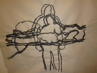
Becca’s work has a central theme of movement through time while maintaining shared space on the picture plane. The mark is a gestural outline, only giving enough information to show the

individual features of

her subject without filling in information throughout the rest of the face

and body. Each figure in her work maintains their identity as they cycle through each action, which leads me to believe that each

action is

also specific to the subject, yet the actions that the subjects is performing seem to be universal in nature. One of the subjects turns her heads in a five stage process, and anot

her, less specific, subject appears to be getting out of bed. Because these actions

are so simple, they help to support the notion of shared space. As the girl turns her head, we see how little her torso has moved compared to her face. In a way, it is a venn diagram of the action, showing similarities and differences of each step. These pieces are presented with a projection of a photo of the original pose, but when all of the information is reintroduced to the drawings, they lose the ephemeral quality that the drawings possess by themselves. With the projection the drawing become less about the quality of shared space, and more about each individual frame, essentially turning into a five frame animation. This style of illumination is more effective in the piece where less information is given (the getting out of bed outline.) In this case, the projected image doesn’t overlap the information already given to us by the detailed lines on the inside of the figure. In another version of the same series of poses the figure have shaded detail, and appear to be an overall impression of the movement. This one gesture turns into multiple people, like the Flash outrunning his ghosted images. Yet there is no speed in these multiple images, instead they sit heavy on the page, definitively together.Another piece relates back to the larger work, but seems to effectively merge both ideas. The small square etching uses different line tones to create a sense of movement and time in just one frame, without the projection. This image has a lighter touch than the ones before it. It has stillness, in the final pose with the thickest lines, which gives the figure more of a sense of place in the picture plane.

All together these works represent a study of motion, and perhaps the constant motions that every person goes through on a daily basis as they repeat the actions that have grown so familiar. Perhaps that is why Becca has picked such inconspicuous actions to depict in her pictures. This gives the repetition a life outside of the depicted action and movement through time. It implies that the movement will continue endlessly.


(apologies for the crazy photo placement)


Tuesday, February 15, 2011

Writ Crit of Jen O'Neill's work

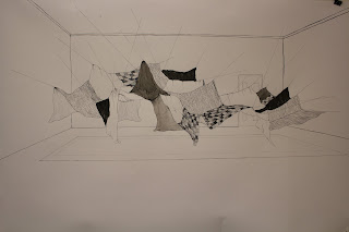
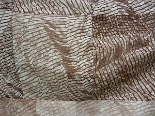
In the Eastern installation space, there is tent-like construction held up by fishing line. The mismatched materials (fabric, clothes, paper) of various colors are stitched together using thick white yarn, which resembles sutures. The tent-like construction is about 5 feet high and touches the floor. There are a few openings that invite the viewer to crawl inside. Once inside, sitting on the floor, the viewer's gaze travels upward. The sewing craft is very apparent since the viewer's eyes are quite close to the fabric. The holes that have been punctured in paper and the perforated holes in fabric from removed stitching stand out since light from outside shines through subtly.
This is the most recently completed piece by Jennifer O'Neill. The hodge-podge tent-like structure looks like it was put together in a quick manner. In comparison to traditional children's forts, the fishing line attachments to the wall are pretty different. There is a clear linkage between the drawing of flying fabric and the installation.
Whereas in the drawing there is no color, the splashes of color in the installation give it a more levity and playfulness. The use of handmade paper in the installation seems to be out of place since the paper doesn't physically act like fabric. The use of cut up clothing is intriguing as well as the use of the white tulle with figures drawn on it. As the figures become distorted in the fold, they resemble the gumby-like mylar stencils Jen is so adept at making.

The use of the figure is prevalent in her work. The figures seem to be female but sometimes it is unclear if they have a gender. In the print work hung in conjunction with the installation, any color is in the red family, which is associated with anxiety. Understanding a specific type of anxiety is difficult. The drawing style is relatively classical. The compositions are nicely considered. The images feel too contained on the piece of paper. Perhaps instead of drawing, some other form of visual communication would be more effective. Something more visceral and off-putting for the viewer.
The heart of the work is very personal and there are a lot of questions for Jen to answer to figure out what she wants to communicate. Explorations with three dimensional vignettes and performance could help elucidate relevant themes.

artists similar
Jean Shin - Penumbra
Candice Smith Corby - The narratives in Smith Corby's intricate paintings navigate through the muddied waters of traditional female imagery, carving-out a space for new ideas to grow.
Ghada Amer
Katy Grannan

Sunday, February 13, 2011

Hi, this is actually Danny!

Response to Critique:

Hi guys,

Before diving into everything I have to say I want to talk about my intensions in writing all of this. The purpose of this post is to discuss what I want my thesis work to potentially be about and what I do not want the work to be about and why. For the sake of my argument for the ideas I do and do not wish to delve into I am using my experiences and experiences parallel to my own as a source for my material in this work—“I should not talk so much about myself if there where anybody else whom I knew as well.” Thoreau, from “Economy” in Walden. The work I plan to make should both educate an audience in ideas of identity (through a lens of a gay identity) as an act of the construction of oneself, as well as emphasize the striking similarity between us all, in which we all assert our identity through daily actions—“It seemed to her such nonsense – inventing differences, when people, heaven knows, were different enough without that.” Virginia Wolfe, To the Lighthouse.

The first section focuses solely on my thoughts and concepts I plan to tackle. The Second section focuses on the formal artwork I plan to create. The third section addresses why I think it is important to put this work out into the world. The fourth section talks about the work that I am not making, and for this project do not wish to make.

1. Performativity

In elementary school I didn’t make calls and I didn’t receive calls—everything was planned out for me. But I made sure to answer the phone when it was an unknown number. Sometimes it was a telemarketer. I’d answer—“hello?” They’d say Mrs. Greenberg, could I please speak to your husband—“I’m sorry he’s not available.” My voice was high pitched. Distinctly feminine.

Judith Butler formed the concept of performativity in 1990 in regard to gender. To Butler, gender performativity is reiterated acting producing the effect of a static gender, while obscuring contradiction. Thus, it had to do with passing as one’s desired gender. Misreadings of her concept of performativity led her to publish Bodies That Matter in 1993. Here Butler spends time noting the significance of iterability, or a regularized and constrained repetition of norms, within her theory of performativity—“Performance is not a single act or event, but a ritualized production.” Thus performativity describes a process of discursive production.

I cannot tell you how many times I’ve been asked, “Can I ask you a personal question?” “The answer is yes. Yes, I’m gay.”

What I am interested in talking about in my work is a little bit different than performativity, but certainly related. As a gay male I’ve had to pass at times as a straight male and also as a gay male. Unlike ideas of performativity, which encapsulates an entire process and gender regime, I am interested in the specific performance—the specific instance in which a conscious decision for passing is made.

I heard the word fag, queer, and gay all of the time. For a long time I didn’t know what these words meant, other than it was the same as calling someone a girl. I certainly didn’t know that I could be a fag—I had boy parts. But there was a gay test. Ask the suspect to look at his fingernails. If he curls his hand halfway into a fist than he is not gay. If he spreads his hand out in front of him than he is gay. My instinct was to curl my fingers.

And the specific moment in which we construct ourselves.

I went to an academic summer program where I met other gay people my age for the first time. They all convinced me that the only way to be happy would be to meet other gay guys online. I created a myspace page at fifteen. There was a special feature where I could search for local guys in my age group with the same sexual orientation. They all had fantastic pictures with spiked hair, fabulous lighting, or bare-chests. The next year I enrolled in a photography class. So much time that year was devoted to taking the perfect image of myself.

II. The Work

With two primary bodies of work, the works will transition by sharing similar formal elements and will be in dialogue with one another. The implementation of descriptive text and titles will focus the content of the work. Essentially, my objective is to resolve the issues apparent in my last critique (the difficulty for the viewer to enter the content/context of the work and a problematic use of physical materials.)

A. The Test, The Self, The Smother Affect

The gay test—it was just mentioned—how do you look at your fingernals?

I plan to draw my hand in the two positions. Like the drawing of my palm print I plan to do the drawings at a larger size (tracing the naturally occurring lines in my hand), and then reduce them to life size, the actual size of my hands. Between the two images there will be text explaining the gay test. The text will be in light red. The drawings will be in black.

Alongside this work there will be two other works—another diptych and a sculpture component.

The diptych will be the woodcut of the back of a shirt printed in black and the photographic image of the front of the shirt printed out on the same paper as the woodcut and traced in red pen in the center of the image where the shirt gathers.

The sculpture component will be my palm print blown up to the size of a full sized bed sheet, and printed as a sheet. The bed sheet will be stiffened in order to have a similar bulbous quality that the photographic image of the shirt has. This component will be presented on the floor. Additionally, selective, significant lines occurring on the palm of my hand will be traced in red.

The notion is that my hand depicted in the two positions is a meditation of the childhood test of sexuality. The photographic component represents a specific individual, an ad almost, a specific presentation. It is wet, raw, and about a body. The image of the woodcut is from behind. It is nonspecific. It could be anyone. It incorporates the same line quality as the sculpture component on the floor. They both talk about identity. A shirt is something one can take on and off though. A palm is permanent fixture. There is a bulbous form both in the photographic image and the sculpture component of the palm.

B. The Construction

The section will consist of images I have gathered from myspace and facebook (of some people who I know and some who I do not) depicting images in which a gay identity is asserted and constructed. These will be engravings on flat sheets of glass with red ink wiped into the engraving. The flat side of the glass will face outward. The engravings of these images will be line drawings—perfect and simple. Ideally these images will be produced to life size and in mass quantity. These images will be paired with text about the construction of self through these pictures. The text will be in red.

These images are also self-constructed in the sense of “selling oneself.” They are like ads.

III. Context

There is an undeniable self-indulgent quality viewers will see in this work. I can’t avoid this. There is certainly a therapeutic element in creating this work as well. However, if this work is for myself and myself only than I have failed the potential of the work. I really do not enjoy talking about myself, I much prefer talking with and about others. What I do enjoy is sharing ideas. The work is about sharing my specific experiences as well as similar shared experiences in order to make the viewer understand and pontificate the notion of having to construct oneself, and that perhaps they already do so (or have done so). Here it is through a lens of gay identity, because this is what I am most knowledgeable in from personal experience.

IV. What the Work is Not About

A. I do not want the work to be about gay sex nor do I want to make work about gay sex and this is why:

People are wrong to imagine teenage boys want to shoot their loads; what they want is a union of souls, which will only incidentally result in a tangling of arms, thighs, loins. Teenagers do not fetishize big cocks, hairy chests, powerful biceps, or blond hair and thick necks; their desire is too general to respond to anything less than eternal love and their love is vague and powerful enough to ennoble any body at all.

-Merla, Patrick, Boys Like Us

There is a very silly notion that a gay identity is about sex. That gender and sex are the same thing. That when making any sort of gay art that there is some element of sex. In truth gay and straight sexuality is only different in the technicalities. What makes me different from a straight person is not my emotional and physical attraction to men. What makes me different than a straight person is that I have to claim and perform my identity in a specific way—granted some straight men feel they too have to claim and perform a socially acceptable masculine identity.

B. I do not want this work to be a historical overview of gay rights:

All history is current; all injustice continues on some level somewhere in the world.

-Walker, Alice, The World Has Changed

I put this quote here first to emphasize that history does matter (Alice Walker built her career off of this notion.) In order to understand ourselves, we must understand our past. Without our past we are nothing. This is certainly true when it comes to gay rights—not until 1973 was homosexuality removed from the Diagnostic and Statistical Manual of Mental Disorders, largely due to protests. A historical approach to sexuality and gay rights is certainly a rich territory to explore, as well as a territory surprisingly few people know about—no one in my immediate family knew what the Stonewall Riots were. However, I simply do not want to delve into this territory for this specific body of work. I want to limit my subject to issues of performativity and a construction of the self.

C. I do not want to use the language of a type:

I have to clarify a little bit here. A few times I have been given advice that I could find a visual metaphor to describe a type of gay people. Once I was given advice that I could depict anuses as miens of a metaphor for gay men. The works on glass I plan to create describe a ritual that is meant to assert a specific gay identity, but also serve as an advertisement as oneself (not a type, as in the same.) The idea of a type in such a straightforward manner would undermine what I am trying to do here. I am trying to talk about performativity and the construction of oneself. The idea of a type is pretty bogus and seems to just perpetuate the same problematic ideas we have about the differences in individuals as of now.

Thursday, February 10, 2011

Writ Crit: Lyndsay Nevins

Lyndsay Nevins installed a mixture of prints, photographs, sketches, and objects, all incorporating found items. These works include recent sculptural installations, new prints, a couple works from the end of last semester, and plans for future projects.
The presentation visually flows from the harsh contrast of the black-and-white print, to the grayed-out collagraphs, and then the pieces that have a range of colors. This organization reflects a conceptual evolution in the work. All the pieces aestheticize found objects to different degrees and manners.

The inked up pieces of trash form a striking aerial-like composition, hinting at another world.
There is an balance of abstraction and recognizability of the objects used. On a wider scale the smaller parts transcend into a cohesive landscape. The actual inked-up pieces also give insight into the process and serve as another form of aestheticized found objects. Compositionally, the actual objects on the floor appear to flow out of the print, connecting these two different elements.
The collographs enlarge the used objects, beautifying and transforming them through scale and the minimal rendering. The scale brings one’s attention to a typically discarded object, yet the faint graphite color reinforces the transient nature of the wrapper and can. Both objects are also visibly used with the can flattened and a corner torn on the wrapper. This element of the prints signals a human’s relationship with the object, and through the rendering and nature of object suggests one of consumption and thoughtless discard.

The Reese’s print stills transforms a found object, but in a way that differs from the others. The
colors used, composition, and dissociated elements taken from the wrapper seem like more of a study than actually hinting an outside relationship. This piece does not fit conceptually for me as much as the other works because it is not necessarily a found object. Because the print analyzes the elements of the packaging, it could be a found wrapper or simply a Reese’s from the vending machine.


On the adjacent wall, the photos show a telephone pole covered with signs and staples. Through
the cropping of these photos the telephone pole becomes striking through the grayed-out colors and rusted staples. Also, the nature of a telephone pole suggests the interaction with and collection of materials from a larger community. It serves as a public announcement space seen by anyone passing through and paying attention. Also, the disintegration, cluttering, and overlay signal the passing of time and general chaos in this type of democratic space.
On the pedestal is an organized collection of objects roughly by color. Not all the objects look like trash, such as unopened medicine and a coiled belt. Rather, as suggested by the names some of the items, they are all from one person and look used or discarded. The sketches above the pedestal are for different possible sculptures made out of collected items or installations involving trash. The color in them is appealing, especially with compared with the monotone prints and the expansion into space is engaging.

Overall, the work signals a relationship to a person or community through aestheticizing discarded, found, or generally mundane objects. In the landscape print, the direct connection to an urban environment is visible with the landscape-like compositions. The work does not seem to take a stance that littering is bad or Americans are excessive. Rather, the message is more nuanced, revealing the knowledge on can learn about an individual or community through the discarded items - at least in the most recent pieces where the items our more visible in their original form. The earlier print abstracts the pieces so that they are almost unrecognizable except by their shape. Throughout the work, the discarded object in its found form is revealed more and more, through realistic depiction, photos, and using the actual objects.
Two important aspects in the work relate the significance of the items used. One is whether the items relate to an individual or a community and the nature of that relationship - discarded items or objects that are currently in use. This work as taking on a relational aesthetic aspect because it uses the object’s social context as a starting point for insight in the work and emphasizes the relations held by these objects. Another important aspect is the degree to which the objects are aestheticized or manipulated by the artist. The organization by color is visually appealing and still allows access to the objects. Through manipulation the objects can be obscured, emphasizing their purely formal aspects, or used in their original form - allowing for relation of the object to be more readily accessed. Using objects in this way does raise the question of where does the ‘art’ come in or how are the transformed. Is it simply through taking them out of context and putting them into an art space, organizing them, or actually manipulating them? Why make them more beautiful or bring our attention to these items? With using these types of materials in an artistic setting brings up of waste - just by the fact that they are used materials. As the work grows, I think it will be important to solidify what types of objects and why they are being used. The sketches provide an interesting direction for the work to take and seeing all the work together
One artist that has some similarities to Lyndsay’s work is Chris Jordan. He uses photographs to portray in mass consumption in visual form.
Also, Peter Menzel who photographed pictures of families with all the possessions from around the world.

Tuesday, February 8, 2011

Writ Crit

Critique of Danny Greenberg’s Work by Liz Belen. 2/8/2011

Upon entering the instillation space where Danny has chosen to display his work, the viewer is confronted with several different pieces. On the wall immediately to your right, hangs a drawing of two figures on a piece of cloth, loosely framed with nails and a piece of glass. This first piece is about 10x8.5 and appears to be a pen and ink drawing on white cloth. The two figures appear to be men and their faces are touching. However, it is possible that the image is simply a mirroring image of one male (due to the similarity in line, as well as facial features, but I am not certain.) Both sets of lips are pursed but they do not appear to be touching or kissing. On the right side of the image it states: “What am I doing lol.” This could be interpreted in many ways, however this statement evokes feelings of confusion, doubt and even happiness from the figures. The line quality of this piece is very capturing and the way in which the artist chose to frame and nail the piece to the wall appears playful and fresh.

Moving counterclockwise around the room, the next work is a white piece of paper with a small, delicately drawn image, constructed of thousands of dots butting up again one another to create an interesting form on the page. The dots are placed in extremely close proximity to one another, forming small shapes that make up the one, large, angular, free-form shape. This shape floats in space and exists alone in the middle to upper right hand side of the paper. The bright colors are a new and interesting component within Danny’s latest works. The color adds movement, complexity and overall, a different feeling (more playful, intricate and dense) to the small, meticulous and repetitive dots that make up the smaller, color-coded shapes. It is unclear whether or not this piece is finished, however I am very interested in how the lovely mark making combines with sections of color to form a very angular and expressive entity that exists on its own in a field of white.


Next, a tapestry or quilt hangs from the wall. Each square depicts the same woodcut that was printed many times in various colors. The squares have been sewn together in a random formation to create a dynamic piece with a great amount of movement.


Because each square appears to be the same image printed in a different color, there is a sense of harmony created through repetition, movement and the lines that have been carved. It is appears that the artist meticulously carved each line in his woodcut in order to create a flowing, purposeful image that is dependent on line weight and mark making as the piece flows from one square to the next.


On the left back wall of the space, two identical images printed on cloth hang side by side, one blue, one black. The images created are woodcuts (clue: large woodcuts that lean against the adjacent wall). The image clearly reads as the back of a man’s shirt, due to the folds, creases, wrinkles, and stripes that are carefully carved. The careful attention to detail, meticulousness, repetitive line quality and intentional subtleties that exists in this piece, as well as the quilt, are extremely beautiful. The top of the shirt is beautifully rendered or carved, as well as the body of the shirt that depicts every single curve, or movement that a man’s shirt would take on throughout the day. The contrast in color between the two pieces (black and blue) reveals introduces a specific conversation, or a binary, perhaps the masculine vs. the feminine. I get this feeling due to the pale, airy and light feeling the pale blue gives off in comparison to the dark, rigid structure that the black ink creates on the stark white fabric. The artist’s attention to detail and the way that he has chosen to render this shirt is very capturing. The lines force the viewer to want to keep looking, searching and following each and every line from side to side, or bottom to top, watching to see how each line relates to the next and so on.

Pinned in the corner, purposefully or not purposefully, is a very small piece of paper covered with the repetitive, static dots that were similarly shown in a previous piece. Small shapes make up a much larger shape that takes over the piece of paper and falls to the bottom. This piece is extremely detailed and grabs the viewer’s eye due to the repetitive mark but also the use of color.

Leaning against the left wall when one walks into the space, are two woodcuts. One has been printed and displays the back of a man’s shirt, and the other, the front of a man’s shirt, however, this piece has not been carved. Placed on top of this wood is a photocopy of the man’s shirt and a red pen drawing on top of that. The image has been placed on butcher paper, on top of the wood, depicting a male figure (the artist?) with a button down shirt that is pinned, revealing his body shape/structure. I am very interested in the lines and shadows that are then created. After knowing the artist and having been given a glimpse into the works, it is apparent that several political and or ethical issues are at work. Unlike the previous pieces, it was very hard to uncover a meaning or underlying concept. Within these pieces the color emphasize the masculine vs. feminine as well as the pinning of the shirt, the attention to detail and the desire to reveal ones figure while remaining clothed. Without titles it is also difficult to pin point exactly what the artist is saying or a specific subject matter. However, these works are beginning to force the viewer to question, wonder and hopefully and definitely piece together this of the self, body and gender that is present throughout all of the works.

Lastly, Vaseline is purposefully placed on an approximately 10x12 piece of fabric and hung on the left wall. This piece allows for multiple interpretations, but reinforces this idea of the self, body and gender in countless ways. This piece, disgusting yet intriguing could be explored more thoroughly and the use of the black Vaseline may reveal different emotions from viewers and create an entirely different piece.

In conclusion, all of these pieces are beginning to create great conversation with one another. Each piece has something new and distinctive to contribute, reveal or express when viewed in a group. The artist is beginning to hammer out the details and subtly, or not so subtly express feelings, emotions and truths that exist in today’s world and his world. The two woodcuts illustrating the front and the back of the shirt, are working to express a binary, a front and a back, subjectivity or objectivity, subtly. Each piece has its own meaning and its own strength. The presentation could be a little cleaner and more purposeful, but overall these works present a great amount of conversation and it is very obvious how much thought, intention and attention to detail has gone into these works!

Friday, February 4, 2011

Quilts, Comics, and Community


During the first week of February (Spring Semester '11), Printmaking & Drawing majors at the Sam Fox School of Arts have been given the opportunity to work with the collaborative print shop Island Press and visiting artist Greely Myatt.

Island Press has a long history of collaborating with some of the United State's most up-and-coming or well-established printmakers; most recently Anne Hamilton, Tom Friedman, and Chris Duncan. This workshop is another element of what makes the Prinmaking major at Sam Fox so unique. Junior and Senior printmakers get the chance to work with these artists in an intimate setting, which allows for students to get real-world insight on what it is to be a practicing artist.

From working with Greely Myatt, it is easy to see that the idea of community is extremely important to him. Not just working with people, but working with the past of the people as well. His work consists of gathering found or discarded materials (wood and aluminum signage) and reforming, reshaping them to give them new life. The idea of the quilt is prevalent in his work as well. Many of his pieces bring to mind the quilts of Gee's Bend, which is not entirely ironic considering his Southern heritage.

Print projects with Mr. Myatt include large-format etchings and collographs based on his quilted collage of found signage and graphic comic strips. The importance of speech in the comic becomes subverted with the print series, "Word," "Another Word," and "The Last Word"- which originated as a collage made up of letters cut from such found signs. Majors were given the task of converting these letters into steel plate etchings, printed in colours reminiscent of the original signs. The same subversion occurs with the large-format collograph of empty speech bubbles and comic panels, where figures are removed completely and instead a textured, vivid yellow background appears. The final collaborative piece is made up of speech bubble collograph plates that fit together like a puzzle. Each major was assigned the task of designing their own bubble with a quilt pattern.

The Printmaking majors are lucky to have worked with such a humble and spirited printmaker/sculptor/multitalented artist as Greely Myatt. His warm accent and down-to-earth attitude are not likely to be forgotten. This sense of closeness and community will live on in the department as we have learned to work together to achieve a variety of goals.