Saturday, March 26, 2011

Writ Crit; Hannah Ireland

Word(s):

SHAPE

partial

fragment

mysterious

memory

altered reality

sublime

subdued

cycle

binary

fantasy

deserted

past/present/future

lucid

ambiguous

teeter

Ecotone: An ecotone is a transition area between two adjacent but different patches of landscape, such as forest and grassland.[1] It may be narrow or wide, and it may be local (the zone between a field and forest) or regional (the transition between forest and grassland ecosystems).


Looking at Hannah’s work I find myself feeling there is something missing, not that the work is lacking something in the conceptual or visual sense or lacking in any pejorative way, but that its intention is to leave the viewer in somewhat of a limbo between reality and fantasy, between something lucid and ambiguous. It teases you by showing all but the essential elements for one to understand it; this is exciting. This binary, the work really being created in between the ‘two things’, seems to exists as a memory where it is partly made of real events and partly created in the imagination.


For this critique Hannah is presenting 6 prints, a model of a proposed project and a three dimensional hanging object. When first entering the installation space one sees the model or sketch of a proposed project, the shape of it along with the colors and layers and all listed. Under that is a sample of the technique of how the paper will be cut. Directly above there is a three dimensional object of cut paper, the shape is rounded at the top and from the side looks like the material is dripping down from the above. The shape is hollow so that when one is standing directly below the one can look up into the object to see the inner layer of the shape.


Moving to the left of the sample there is the first drawing. This drawing could be a combination of pen, pencil and water color on a large sheet of white paper. The imagery is soft and cloud like, one could see if they wanted the view of the top of a mountain through clouds, a fantastical approach creates an idea of an imagined or remembered landscape. It is almost dream like. There is minimal color (mostly shades of grey and a little blue) and all of the imagery is confined within the edges of the paper and does not attempt to explore past the boarder of the page.


The next piece, to the left, does not float within the boarders but is grounded to and touching the top of the paper. This print seems to be a photo litho or xerox transfer. The imagery is more founded in reality than the piece next to it. The image could be of the side of a mountain or cliff or an embankment. There are trees that seem to be growing off of what would seem to be the surface of the land but to the viewer they are growing upside down. Similar to the work shown to the right, this print is of a landscape, possibly at the top of a mountain or cliff, yet both of these images are not straight forward, they create a sense of confusion and fantasy.


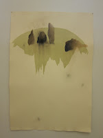
The next print we see if a digital print with water color. This print, out of the six, is the only one that presents the viewer with a clear representation of nature or a landscape. The image of what could be grass, weeds, or moss is floating within the boarders of the white sheet of paper. Below the nature there is red that is falling, steaming, off of the object.


The next three prints seem to be a series, they all share similar shades of grey and red, they are all on an off white paper and are the same size. The two on the ends are monotypes with drawing and painting, the monotype elements create a grounding shape on each of the prints that the middle print or drawing does not have. In the print on the right, the monotype shape is floating within the edges while the print on the far left it is touching three edges of the paper and creates an even stronger sense that the image is grounded at the bottom of the page. The monotype shapes do not seem integrated quite enough with the more delicate and detailed hand drawing and painting.


The print in the middle has a sublime quality. The graphite that is pushed into the paper towards the middle of the page has become shiny and sections of that top layer of the paper in these parts have been cut and lifted from the print. These shapes are similar to the shapes of the three dimensional object that is hanging as you first enter the installation room, triangles and diamonds.


What I most like about Hannah’s work which I think the first two works accomplish, especially the print on the left, is this feeling of limbo, this in-between, the ecotone, a feeling of vertigo. The print that stands alone is almost too lucid and the ones on the third wall are in a way too ambiguous. The feeling I get from looking at the print on the first wall on the left is that I need to be standing on my head to understand it and then once I have done that to see it, I then would question why I am standing on my head. It’s a cycle of confusion that is grounded enough in reality that it makes one want to take that leap to understand it. It is balanced between ambiguity and lucidity.


There is a movement to the three dimensional object: it spins around as the air flows through the room: this appears to mimic or could hint at the movement that would need to happen to fully grasp the imagery of the prints, to understand them one would have to physically move into their space. Many of the prints here make me think of memory. How it seems it should be easy for us to remember something, we feel it there somewhere in the backs of our heads but we cannot quite reach it. We teeter on the edge of remembrance when trying to convey what’s happened in the past and although it can be unsteady, it is a balance, and that I can see in some of the prints here.

Another theme that came to mind was what I thought of as “addressing the shape.” There no doubt is a repeated motif, a shape, rounded at the top and peeling over the edge, dripping down and dissolving. The shape appears within the three dimensional object, all of the prints in somewhat varied forms except for the photo-transfer print where the shape is not directly described but the top of it could be seen within the negative (or white) space of the piece. In some of the prints I think the shape more successfully embodies a balance of reality and fantasy, such as the middle print of the series and the two prints at the beginning of the installation space.


Artists that came up during Hannah's critique were:


Jean Antoni and a piece called "touch" where she tightropes on the horizon.


Francis Alÿs and The Green Line (2007)

13chan_CA0.jpg

New York Times Article


Also Anselm Kiefer's Merkaba series

c02fb7ca.jpg


"The Merkaba and Hechaloth literature, as discussed in the Kabbalah texts, deal specifically with the ascent up to seven heavenly palaces or temples, which represent the seven attainments of divine spirituality. For Kiefer, the Merkaba, or mystical chariot used for this passage, is not the vehicle towards a single apocalyptic Judgment Day but, rather, a means to the ongoing process of working at art." Quote from Gagosian website, more images

Thursday, March 24, 2011

Writ Crit: Grace Hong


In her most recent installation of work, Grace has chosen a range pieces made in the last year; some of these works I have seen before, while many I have not. In this critique I will choose to address those pieces which I find more striking and compelling and those with which I feel most connected. In surveying Grace’s works, text and tactility are the most prominent elements. While I feel compelled to touch and even explore (I peeked inside the t-shirt; I needed to know what the graphic on the front (now inside out) was) many of the pieces, I found that I often didn’t feel the need to read all the text present. Much like the steady embroidery-work that dominates her current work, I found that the text came to embody a sort of intimate meditation or musing; as text, after a few lines, it almost become more important as a signifier of the time and self-meditation spent with these pieces - reflective of any time one may be alone with his or her own inner monologue. 


The electric blue piece above best exemplifies what I find most compelling in Grace’s work. While most the works presented represent a muted, pastel, or even white palette, this piece is an electric blue with fragment, all-caps text in red, yellow, and blue. I notice Grace often seems to use these flashes of bright reds or blue in her work sometimes to evoke a playfulness, but also to speak to what I imagine to be a state of inner tension or anxiety. In this electric blue piece, this is how the text feels to me. I only need to read the first few lines to understand its role as intimate personal dialogue, a futile fighting perhaps, with oneself about things that had happened that can’t be changed. This automatic writing/inner monologue text embroidered in bright form makes me imagine Grace slowly embroidering it, stuck contemplating these past actions, drawing them out in her mind. Combined with the violent wrinkling of the paper, I get a very visceral vibration from this piece. It struggles to become more than just this page, this documentation of past events, perhaps traced over and over in the mind. I can also read all the time the artist spent with this piece, creating its wrinkles, slowly creating its text, endowing it with a life of its own, in which I read the potential frustration, sadness, regret, or even just the wanderings of a mind with extra time, tracing over the if’s and but’s of the week. Above all, I feel as if I interact with this piece on a very intimate level, which makes it the connection very powerful. 


Grace’s HOW ARE YOU? piece I feel evokes a similar quality yet not as eloquently, humanly, intimately or as strongly as the blue piece. The embroidered rhyming text pieces seem like mental musings to me, though I am unsure of their purpose, besides their childlike, playful qualities (indicated by palette, silly rhyming, and simple drawings - although these pieces hint to very adult realities, like prescription and beer bottles). The grey t-shirt piece, I’m sure about. I’m unsure if t-shirt chosen (and its graphic) were chosen specifically for the piece. It also gives me a creepy feeling of imagining the body plucked out, violated by this cutting out of text... but I find the interior facing text idea to be very compelling (perhaps if images of the shirt worn were presented or the like). 


And now, pillows. I know Grace’s intentions with her text messages pillows were conceptually of collecting these comforting things to come back to, much like a pillow you can hug or squeeze or curl into bed with. However, because of their small size and pastel text, they read as very ‘cutesy’ - I almost think of baby pillows, which weirds me out (I guess because that would mean they’re not intended for me/out of my context). I am more comfortable with the larger blue pillow, and have felt compelled to pick it up and have it on my lap in a past studio visit. At first, “Pillow Talk” seems too mature of a title for this piece (given the handwriting paper and text, the content of the questions), but I think it actually alludes to the childlike nature of true intimacy. I also imagine this pillow as a stand-in for a bedtime companion, something to hug and talk to as you fall asleep in bed alone. I don’t feel as connected to the building pillow, perhaps because it feels more decorative or stylized and I don’t know the building. I am intrigued by the proposal for what seems to be a 3-4 ft tall plush hand, but am trying to imagine it in actuality and what that hand might mean at that size... I worry it might seem god-like if it surpassed 3 or 4 ft (or King Kong?). As you embark on this project, I suggest you consider human size relationship/interaction and its possible connotations or interpretations - a hand that big also makes the hand as symbol very important.

To Check Out:

Fiona Banner


“pushing the limits of text” - potentially interesting visceral qualities also

Also suggested, the book Art and Text, as was mentioned in the critique this past Wednesday:

Wednesday, March 23, 2011

Danny's update on thesis work

Hi guys,

So I am coming to the point in my work where I am creating my final pieces/ideas for presentation. I thought this could be a nice way to update everyone as to where I am right now, 1st technically, then conceptually, perhaps more coherently than I could explain in person.

1. facebook /myspace photos
-I am going to draw these as trace monotype drawings, and use a simple paper japanese binding to bind these drawings together into a book form.

2. blanket
-I am re-drawing the lines in the palm of my hand (this time in a more exacting fashion) and am blowing up my palm 2,500% to 5' by 7' woodcut. I wanted to carve this woodcut by hand, but because time is ticking away I plan to use the CNC router in architecture to create this woodcut.

3. shirt woodcuts.
-I created a simple woodcut of a shirt as a way to test some ideas I had with embossment, creating physical an imprint into the paper. My drawing that was on the wood itself drawn in graphite transfered to the paper. I plan to emboss, test this graphite transfer method further, and create more woodcut prints.

4. large trace monotype
-I am working on a 4.5' 6' ish graphite transfer of an enlarged image of my hand. I plan to draw it in two gestures.

Conceptual place:

Portrait (self portraits):

LGBT studies are centered around the lives and stories of lgbt people more so than abstract theory or scientific studies. In my work I am exploring self portraiture. Essentially, the shirt woodcuts, enlarged hand drawing, and blanket piece are all varying forms of self portraiture. The blanket piece which consists of the lines of the palm of my hand, will be printed in black, in woodcut form, creating permanent lines. The shirt woodcuts will be embossed with graphite, but are more ephemeral and more specific to a very specific (almost photographic) moment in time. The large trace monotype is in some ways the most traditional self portrait, because it is a drawing of a part of my physical body (hand). The book of portraits are other people's self portraits that I have gathered, and redrawn, making myself both as an author of the work, but also drawing these portaits in a similar minimal style, drawing a connection between the similarity of this activity of self portraiture.

Saturday, March 12, 2011

Rachel Sperry's Writ Crit

In her work displayed for Writ Crit, Rachel S., a printmaker new to Wash U who will be a major next year, exhibits a strong use of printmaking techniques and uses them along with her humor to make a social commentary on the production of food, and call upon larger concerns of society’s excessive modification of the natural. There are three groupings/series of works present. The first is made up of life size paper masks and multiple prints of a reductive woodcut of a blue wall water at an aquarium. The second consists of a print of layered agricultural structures, a covered petri dish with an image of an industrial chicken farm, a photocopied annotated except from “Eating Animals” by Jonathan Safron Foer and a book with layered translucent pages that progresses from what looks like a graph, to simplified landscapes. The final grouping is a series of seven prints of sugar lift etchings of men who look like they belong in porn magazines displaying increasingly exaggerated male anatomy made up collaged wildly colored corn images.


To begin from left to right, with the “At the Aquarium” piece, the first thing you see is the eye level masks expressing variations of awe, disgust and unhappiness. Rachel’s intention to place them at eye level forces the viewer to interact with them, rather than suggesting the viewer put them on. The choice to make the faces into masks suggests that these emotions are performed, or hiding something behind them, creating an interesting disconnect between these performed emotions and the expected emotions in the situation Rachel has put them in.Surrounded by prints of a reductive woodcut of a large aquariums and the text “AT THE AQUARIUM, 80 MILLION GALLONS entertaining intrigue.” The use of the multiple with the aquarium images conveys a sense of excess, although perhaps a bigger print, or even more prints, could also evoke a similar feeling. The faces suggest an overwhelmed reaction to this excess and reaction to a spectacle. It’s a negative reaction to something that is designed to be fun, and to be an attraction – instead in its excess overwhelms. In this same way, in the vertically hung prints the eyes (taken from the mask images) are not immediately noticeable, suggesting the viewer of the aquarium is lost and becomes only watching eyes to this overwhelming amount of water, stimulation, and information.

As we move to the center to the print of agricultural structures and the books and objects on the pedestal, Rachel introduces her concern with food production. This work exhibits an interest/ or rather concern with mass production, alteration, artificiality and ethics of how food is produced. For me, being from the cornfields of the midwest this print is a very familiar image and brings to mind harvest time when all the farmers bring in their corn and this huge machinery is running constantly with yellow rivers of corn, so much corn that it completely stops looking like it and becomes part of the machinery. This loss of the image of the natural element when it is in such great quantities relates to how in the print, you don’t actually see any land as it is hidden by the excess of printed farm buildings. To me this says the machines and processing of the corn plays a bigger role in food production than the land that grows it, which loses the root of where our food comes from. The except from “Eating Animals” by Jonathan Safron Foer and Rachel’s annotations extend the interest in food production into moral and ethical concerns of food production. Though the different underlining and notations appear somewhat academic, they reveal an honest and invested interest in the subject matter. They start to form a conversation around the content between the author, Rachel and the viewer. Particular underlined passages that stood out me in the context of Rachel’s work surrounding it were “shame is a response and a responsibility” and “language is never fully trustworthy, but when it comes to eating animals, words are as often used to misdirect and camoflage as they are to communicate.” The second quotation brings up the idea of something hidden, an idea present in the translucent layers of the book, heavy layering of ink in the agriculture print, and the hole in the covering of the petri dish. Rachel gives the sense in this work that the truth is always hidden, unethical practices, the land, and information in general. This also relates back to use of the mask in the Aquarium series.

The last series on the end, however, seems to do the very opposite of hiding. Through the increase in size, color and ridiculousness of the male anatomy from left to right in the seven prints Rachel calls to mind and makes a statement about the unnatural modification of our food. It’s really funny and I read it as the food industry taking the role of the men in the prints and saying about their genetically modified agriculture and production practices, “look at this, isn’t it impressive!?” and Rachel’s commentary back is that “No, it’s ridiculous, excessive, unnatural, and you’ve gone too far.”
But beyond being amusing, these prints also bring up her concern with the unnaturalness of our food thanks to Man’s tampering, as well as issues of gender and masculinity. Although I think you can read the “man” in these prints as standing for “mankind” in the larger picture, masculinity is obviously as issue raised. These prints are taking masculine pride and making it “bigger and better!!” and bigger and bigger until its altogether too far. In the context of the other work, to the left, Rachel seems to be conflating man with machinery and as being the artificial hand in something that begins very simply with the earth. Man’s alterations are overtaking the natural. Rachel uses color to emphasize what is not quite right here.

The Aquarium piece also reveals man’s artificial hand as the ocean is contained in glass. Along these lines, Rachel also uses color strategically in all human elements and skin tones both in the corn porn and the Aquarium piece. She strips away all warm life-like colors for a cold light gray – which seems to be commenting that with all this excess somehow we are further from our humanity and unnatural.

Overall, it’s very evident that these are issues Rachel is genuinely passionate about, and there is really a lot here to look at and talk about. I see the three sections of work present here as relating to three different stages in the encounter of these issues brought up. The Aquarium represents the initial encounter with this information, and being overwhelmed and maybe a little horrified at all that is out there. The farm grouping represents the research, conversation and discovery. Finally the corn series is using humor to really tell us what she thinks about it and make a statement. The large idea I take away from Rachel’s work is in the excess of information out there the duality between what’s hidden, and what’s out in the open - what the agriculture is proud to share and what we might have to research ourselves and talk to each other to fully understand and be called to action

An artwork I thought of in relation to Rachel’s work is “Apology to Roadkill” by Shaun Gladwell.


In the writ crit conversation Lisa also mentioned “skateboarding video” also by Shaun Gladwell in relation to the repeated reductive woodcut in the Aquarium piece.


Other artists and works that were brought up during the writ crit conversation were:
“Radioactive Cats” by Sandy Skoglund and the activist work of Just Seeds Cooperative.


Friday, March 11, 2011

Lauren's Write Crit!


Lauren has chosen to display her new body of work consisting of prints and drawings of portraits on the walls of the east installation room. Upon entering the room, five of the nine pieces are placed on the middle wall in a row, relatively small rectangular drawings and prints of female portraits on uniformly white paper. The uniformity in size and color can be related to the yearbook photo reference in her work. The three of the pieces are line drawings done in gauche or black water color on top a gray background, layered with text in acrylic or watercolor. The other two pieces are done from a pronto plate; white and gold acrylic paint over one of the images while the last one is just a print from a different plate. It’s significant to note that the only color, other than black, white or gray, is the gold paint used in the second portrait from the left. From right to left starting with the first portrait the texts read; “what’s your name baby girl,” “hey hot stuff,” “smile,” “hey you got a husband” and the last image is without text. On the adjacent wall are the second set of prints, four larger prints; three are of one etching and one landscape, all also layered with text. The etchings are also of a portrait, I assume it’s a self portrait. The first image is the print of the etching with the text “you seem like you would have done anal”. The landscape image is of a road and a hill with a sign that reads “you’re such a skank” done in acrylic, ink and charcoal on rice paper pasted on white paper with text that’s hard to make out but I assume it says “on my boo I can see parts of her I do not need to be seeing.” The last two pieces are both printed on rice paper which creates a translucency of the printed image when its pasted onto a more opaque surface like the last piece that’s on white paper with a sketch and the text “I see a lot of myself in you” underneath it. The second to last image has the text “a little soft” written on a card that’s pasted between the two pieces of Japanese paper. The images are on separate walls because I don’t see them as being directly related in one body of work but similar in the way that they both are biographical and dealing with identity, play between text and image, and layering.


Because I see Lauren’s work being very biographical and about trying to interpret her own identity, it’s hard for the viewer to relate their self to the work specifically. This might not be so much the case if the viewer wasn’t aware of the several self portrait pieces of Lauren. Compared to Lauren’s previous work at midterm, I feel that she’s going for a different body of work but one that’s more related to what she proposed to do last semester, dealing with identity, self, and narrative. Although her previous work on the prints of her black male friends at midterm, which dealt more with race and prejudice, still echo through her current body of work because the portraiture, orientation, and line quality are the still similar.

A lot of Lauren’s previous work also deals with pieces that are layered upon with multiple prints, drawings, or text. I see this as Lauren not only building up texture but also context. While her line drawings themselves are expressive in their own way because of her use of line but the images become more successful because she uses layer to build up an image. For example the four images on the right wall; the over wiped or ghost print of the etching on Japanese paper that’s adhered to another sheet of paper emphasizes the translucency of the print and allows the text to be seen. Specifically for the three pieces on the right, I don’t think they would have been as successful if everything would have been done on one sheet of paper. The first image on the right exemplifies that because the etching seems flat compared to the other pieces, I feel like she can go back into it and work it a little more. But in the case for the five images on the adjacent wall, Lauren uses several types of medium to create dimension and complexity within each peace although everything is contained on one piece of paper.

I think it’s important to note the words seem to be just as important to the piece as the line drawings are. Lauren specifically chooses the text to relate to the certain images, as to the drawing and text begin to form their own conversation. Although both components are vital to the piece as a whole, the text in each piece seems to be more of a response to the image rather than the image responding to that selection of text. The way Lauren draws or writes the text over the imagery seems almost graffiti like, or similar to how many of us would write over other kids’ school pictures in the year book. The text also ties the piece to a specific point in time that was possibly once important or relevant to Lauren. So the portrait just isn’t a portrait of a girl, but the text somehow emphasizes the images relevance to the artist Lauren’s choice of text for each image seem to be insulting or derogatory, like cat-calls towards women. Most of it comes off as being sexist towards women, as in the text seems to be coming from a male voice rather than a female voice and then being echoed in the portrayed figure’s head. None of them are positive, or at least the imagery reaffirms that none of them are intended to be positive. I feel like the body of work might be commenting on a negative self image or how Lauren might interpret the self image of others.

An artist that has made similar work, in the way that she combines imagery and text along with feminist themes would be Barbara Kruger. I know Lauren even mentioned her, but the connection is almost inevitable. Both works are similar in the way that the text is a response to the image and the lacking of color. Kruger’s work doesn’t seem as autobiographical but she tends to use text to comment on the image of society as Lauren uses text to comment on the images of specific girls or herself.

ERIN MITCHELL!

This is Erin's writ crit...!


What consistently draws me into Erins’ work is her drawing style—and I like it best when I feel like it is personal, when I feel like the marks she has made are essential to the piece. I love that the pinkish-blue mass at the top of the “hole” piece resembles clumps of hair—maybe that’s an association I carry from her past work, but I do enjoy the ambiguity of not knowing whether the shapes are meant to be abstract or concrete. The same applies to the graphite hole under it. Though this drawing may visually resemble the other works in the room—in terms of the colors involved—, I really think it operates quite differently. It is the "unknowable" in the piece keeps me coming back in order to try and understand the significance of the presented imagery.

The other works, meanwhile, are different in that they read very much as specific portraits, and at the same time, not. They seem to be portraits in the obvious sense that they represent people's faces, but the accumulation of different faces within a single drawing makes for an unconventional style of portraiture. They all seem to be drawn in different ways, which leads me to presume that they're all meant to say slightly different things. Not to say they should all be drawn in the same style, but the ambiguity here is something I'm less comfortable with—the overall grouping of these drawings sends me mixed messages.

In order to make sense of these, then, I look at the types of faces, the colors used, and the marks present across all four drawings. All of the faces portrayed seem to be relatively young, so I wonder if this is a comment on a generation or a group of people within a certain setting (I assume I would think this without knowing where the images came from)? Is it larger than that? Is it about what we can read on these people's faces? Most of them seem pensive, reflective, and slightly anxious—inward focus is the predominant theme.

Some faces are hard to read—these are the ones in yellow, and these are the ones that bring me back to the feeling of trying to gauge an expression on a person's face. It is hard to tell what these people are thinking about in specificity, and the yellow makes us fight to be able to see their faces in addition to puzzling out their emotions. The paleness of the blue brings out the jarring, insistent qualities of the yellow even more, and the coral-pink color comes across as more of a visceral red at first glance against the lightness of the other two colors. My favorite of these portraitures is the one in which the faces are rendered with rough black charcoal lines—the grittiness of the texture makes for a nice contrast to the amorphous and washy splashes of color. In that piece, the reddish-pink seems to reveal a strong inner emotion on the part of the young man whose face it partly colors.

Other clues in these pieces include an image of a clock that recurs—on the left with the hands pointing out roughly 11:45, on the right marking 1:50. Handwritten text in the upper right corner of the piece reads, "The Rabbit Hole," and a scrawled repetition of the word "what." I see the text "The Rabbit Hole" as an invitation to an inner psychological space and the repetition of "what" as an expression of frustration. The clocks seem to indicate that time is passing in these pieces—perhaps too fast?

What is also interesting about this grouping of pieces is the arrangement of pieces of tape amongst them. Just looking at the tape pieces brings a number of things to mind—they resemble anemone, or stars, or flowers, but they don't seem to be about any of those things. What I'm struck by is the way that they seem defeated and limp. I'm reminded of an 3D-Design class assignment where we were asked to create a wooden modular sculpture piece that would resemble the motion of a person falling, and would instill a feeling of empathy in the viewer (so that the viewer would be nervous about its fall and want to help it balance). In a way, these tape pieces seem to be withdrawing inward—perhaps my read of the emotions on the people's faces are influencing the way I see the tape pieces.

With prior knowledge of how Erin usually presents her work, I assume that these are pieces of tape that have been used to hold up these pieces before and that have now been torn off and arranged into clusters. You can see slightly torn marks on the paper where the tape has been ripped off. So I also think of band-aids, and how a band-aid protects a wound but eventually has to come off, and never without pain. The work on the left (featuring Danny's face) seems to me to be in an earlier stage of completion, while the works in the middle seem a bit more resolved—does that mean the tape gets ripped off as the works mature? Or is this all speculation? The only thing that makes me wonder about the tape as a material is its presence now as a sort of sculptural/decorative object.

In terms of artists, I think of:

Darrel Morris

I’m thinking about this admittedly because he embroiders, and I’ve been researching that lately—but he often portrays a certain type of person—usually forlorn aging men. He also has a background in printmaking, which makes sense when you look at his work.

Margareth Doorduin

Her photos are strange and seem to depict psychological struggles. I really love the gestures and how they spark empathy but also seem clinical and enforce distance.

Bohyun Yoon

This may be a bit of a stretch, but this artist works a lot about control systems (government, out

side forces, etc?) and what they do to the individual body.

Wednesday, March 9, 2011

Bern Porter

I remember the leisurely days of part time employment, bread baking, and movie watching with a fierce nostalgia. Those were also the days of many blog posts, so in the name of that nostalgia I am writing a post for the first time in forever.

About Bern Porter, who claims to have invented mail art.