Wednesday, February 26, 2014

Georgia's Writ Crit

Georgia’s Writ Crit
By Charlotte


The first piece consists of a series of black and white etchings and graphite drawings on paper laid out sequentially.  All the etchings are monotone aquatints depicting text, figures, and sparse scenery.  There is a wide range of tones from pure white to pure black and they are all generally the same size, except for one.  The drawings are the same ones we saw last semester, there are figures, text, and scenery with a fair amount of rendering and realism.  All the images are displayed in a single line at eye level across the wall.  The content of the work suggest that it should be read as a narrative from left to right.  Some of the drawings from last semester have been transformed into etchings, and some have been deleted all together. 

The second work is also laid out in two long horizontal lines composed of many smaller images that are all printed in color on regular printer paper.  The upper line of images is comprised of photographs of the artist in various situations.  The photos are sourced from the apple photo-booth program, and are commonly referred to as selfies.  The lower line of images shows screenshots of word processor documents.  Each one is titled “Untitled 2” and contains blocks of text.  The images are all rectangular shapes and vary slightly in size.

Georgia’s artist statement very effectively explains the concept of her work and the way it means to address the plethora of issues mentioned and I actively searched for these elements as I observed the work.  In the etchings the viewer really gets an idea of the realness of oppression and the struggle to deny inheritance.  The development of a symbol (Lilith’s weapon/token bunch of reeds) is a huge step forward from the symbols we were introduced to last semester.  This work is particularly strong in comparison to the other; it has a distinctive clarity of idea and tone that the second piece lacks.  The second work represents a brave new direction for Georgia where she has taken real ownership of her writing and has left behind the safety of her classic drawing style.  There are some lines and narratives that can be followed through the diarist-type entries but it is difficult to find a continuous thread.  For some of the images their accompanying text makes a lot of sense, some of the others seem less purposeful.  There are so many issues that are mentioned in the text: queer, trans, people of color, coming out, political deaths, autonomy, mental health, gay/straight perception, agency, hetero-normalcy, etc.  While the subjects make perfect sense with Georgia’s statement, collectively they begin to feel like a political rant and it is easy to lose the successful moments where she has shared something deeply personal and relevant. 

Historically discussions of Georgia’s work have come to the difficult fact that the people outside of your focus feel alienated by the work.  There needs to be a dialogue that addresses this feeling which may also have to do with a fear of critiquing something that is not part of your own life.  However, the very specific and personal stories very effectively assuage these feelings.  We really need to move beyond the generalizations of movements and themes; they hide what we really want to know about: you.  Your experience makes us, even forces us to understand. 


Questions

1. In the first work, it is significant that some of the images are etchings and some of them are drawings,
·      Do the drawings represent moments that require more sensitivity of mark?
·      Is this how they will be displayed?

2. Text has is suddenly playing a major role in both works, is the placement/word choice working?

3. Do the less serious selfies/confessions (friend tattoos and fuck the patriarchy) work with the rest of the series?
·      Do the selfies end up parodying themselves?

4. What are you trying to say about these issues?
·      What’s YOUR issue/who keeps YOU down? (ex. Adam keeps Lilith down, this is very clear, the other work would benefit from the same clarity on your side of the equation)


Georgia’s Artist Statement:
My work is focused on the subjects of lineage, trauma and mysticism with a queer and feminist lens. I take the stories of dissenting and mythic women such as Lilith, Judith and St. Teresa, and claim them into a contemporary archive through the literal re-drawing of their mythologies into comics, zines and prints. My work makes use of instant archives such as webcams, blogs and cell phone pictures alongside more traditionally made prints and art historical images in order to insert these mythologies into ordinary life.
The concept of “queering” something in academic contexts means to come at something from the side, horizontally; to attempt analysis without binaries and to tease out the layered complexities of a subject that may sometimes contradicts itself. I am interested in queering as
a methodology that is connected to and rooted in lived experiences of structural oppression that force one to live in contradiction and survive anyway. In the same vein, I am interested in the qualities of what I have termed “the terrible inheritance” - a history that oppresses women and people of color, requires patriarchal tools for their liberation and renders queerness invisible.  What are we to do with this history? Short of renouncing what we cannot truly renounce, in what ways can we use and claim these stories to build our own myths? My work attempts to locate and document spaces of resistance and illuminate the complexities of my contemporary identity: as a woman and a queer person, but also someone who benefits from inherited power.


Artist Suggestions:

1. Francisco Goya

2.

3.

4.

Research/Reading Suggestions:

1.

2.

3.
4.


Monday, February 24, 2014

Joyce Hankins Writ-Crit


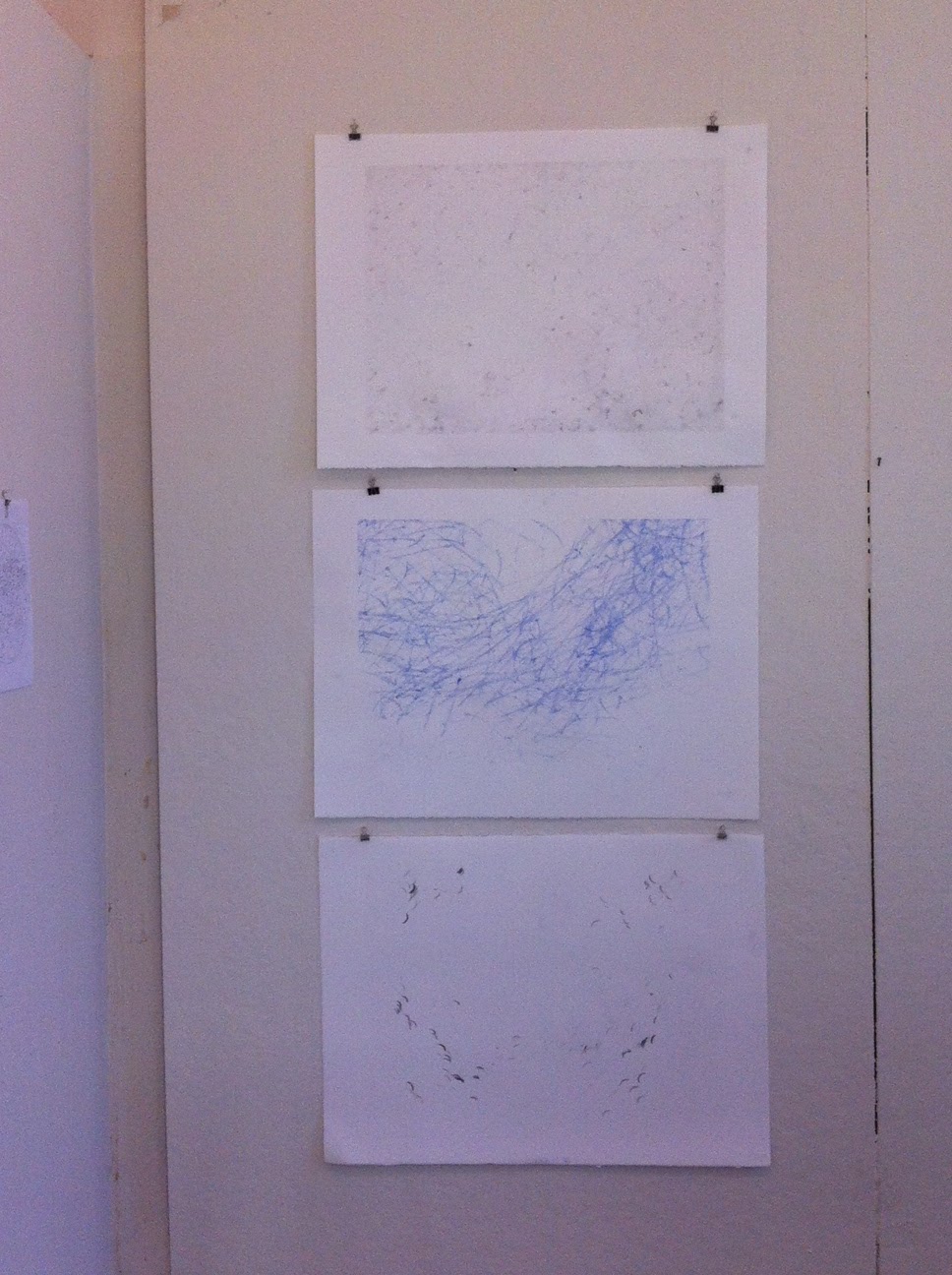
The work in Joyce's studio is a combination of some of her longer term, time based works and a the newer projects she has been delving into. The oldest piece is the ongoing scarf, installed in the same way as our final crit last semester, but longer. Three prints showing accumulations of marks created from carbon paper setups beneath the stools in other studios are hung vertically on the wall. The major new work is a series of etchings of sidewalk cracks accompanied by a taxonomy of black and white printouts featuring natural phenomena including spider webs, geodes, crystals, honeycombs and other clustered structures.


The presentation of Joyce's work is very clean and tight as usual; the most curious and in process area is the taxonomy of pictures. There are five etchings of sidewalk cracks that correlate to five black and white images of sidewalk cracks that sit outside the taxonomy. The organization of the reference photos follows a linear pattern that is reminiscent of Joyce's mind maps; the images neatly reference their neighbors in form – displaying a kind of cinematic movement or zooming into the patterns. However, the association of the images seems to be limited to the general category (“nature”) and the form, rather than any association with the processes. For instance, octopi to crystals and trees to spiderwebs. This section of the work appears to be the most mid-sentence and perhaps the most lucrative in that sense. The carbon works are interesting turns of process but present messily and without much depth; the marks on the paper don't contain the richness of the accumulative car seat etchings. I would be interested to see if a different sort of ground and a thicker transfer medium could yield better results. The scarf is growing so long! But while it is growing longer, it's form hasn't change much. The installation of the scarf doesn't feel very different despite it's greater length.

I do not have Joyce's artist's statement, but from what I know about Joyce's work she is interested in accumulation as a record of actions and accumulations also forms of organization. These ideas bring into question ideas of ritual, history, and habit. In many of her previous works, and in the scarf and carbon pieces, the frames of reference have been aspects of the everyday; the works focused much more heavily on the imposed structure than the subject – the structure became the subject of the work. I am interested in the turn to the natural subject and scientific phenomena. But I see a divide in some of these phenomena, for instance, sidewalk cracks that mark degradation and wear from use differ greatly from honeycombs, which are built for an animal function, which in turn feel very different from crystals. There is the tension of time – the super ephemeral spiderwebs vs. geologic time or the time of tree growth. The taxonomy here assimilates and flattens these differences in subject to only focus on their similarities of form. The subject of nature brings up a huge breadth of cultural and philosophical ideas including transcendance, change, life & death, time. The work at the moment, although it beautifully highlights delicate and impressive structures, doesn't seem to consider these points as part of its scope.

The etchings are also very logical and systematic steps in relation to their images – they have an exacting one to one correlation in size with the photographs. The delight of the scarf is in part its growth and its restlessness in relation to most of Joyce's work. The scarf, although still in progress, has this capacity to overwhelm with its uneven stretching and dangling strings. The scarf seems closest to communicating the feeling of being overwhelmed by a self-imposed structure. 


 There are a few moves in this studio that I am really really excited about. One is the gesture towards the outside, both in the natural references and back in the pin piece. These pieces are using structures and systems that are already there and that have a depth of meaning to them that extend past the artist. I would like to see the work explore its assertions in terms of subject in that way. I am also excited about etching, which is not a new process for this work, but in process has the potential to echo some of the accumulative processes that Joyce is interested in.


Questions for Joyce

What does turning these images to etchings do? In what ways can the etching process enhance or express the types of accumulation and degradation you are interested in? What happens if you print them on top of each other, or multiple times on the same paper?

When you go to a museum and see work that really inspires you and makes you want to rush home and make art, what about it makes you feel that way? What kind of work is it?

What is the 'subject' of your work? (rather than the form, or concern.) How does nature function as a subject?

What are the etchings desiring of? Why are they made and what do they tell us?


Some artists/theorists:
Mircea Eliade Myth and Reality
religious theorist who asserts that myths provide the explanation and backing for ritual. What is the myth behind your rituals?

Ghada Amer
working with a layering and accumulations with similar form, but with really explicit subjects.


Marina Abramovic “Art must be beautiful; Artist must be beautiful”
I kept thinking about performance art in the way that your works incorporate repetitive structural movements and actions. I do not know a lot of performance art but this is the piece where she is brushing her hair over and over again.


Cat Mazza
knit artist whose work is decidedly different from a lot of elevated craft knit works out there. Still very concerned with knitting as a craft and also the discourse around   women's work, but you still might like her stuff. It is not kitschy.


Friday, February 21, 2014

Olivia's Writ Crit


Olivia’s body of work is introduced by a short description that talks about the work in terms of three main ideas: experiments in observation, visualizing that which is not inherently visible, and modifying visual technology. 

The work consists of five series: 

The first includes four selected heat prints using thermal paper. The prints are 2”x3.5” and mounted on 6”x6” white mat board.


The second series includes three photographs taken with a modified pinhole camera. They are 4”x6”, printed on glossy photo paper and mounted directed to the wall with little spacing between the photographs. They are a variety of pinks, which is the first introduction of color we have seen in Olivia’s body of work so far. The third series includes five photographs taken with a digital camera that has had its infrared blocking filter removed and lens altered. They are 4”x6” and printed on glossy paper as well, and  they sit directly under the modified pinhole photos. Even more colorful than the pinhole photographs, these images show grainy abstractions of color. Above the second and third series are print outs of a digital camera and a digram of a digital camera. 


The fourth  series consists of four 8.5”x11.5” digital scans of “breath captured on glass.” They are arranged in a 2x2 grid with little space between each image. The composition is mainly black with the captured breath registering as green near the center of each image. Above this series are two printouts about scanners.


The final series includes two 17.5”x13” images that sit one on top of the other. They are the largest images and the only ones with recognizable forms. These images are made up of five and fifteen composited minutes of a web cam. Similar to the breath images, the compositions are primarily black. However, in the composite series, human figures appear as ghostly white apparitions that pile up. The setting and pathways in the fifteen minute composite are more clearly defined as a result of more buildup of figures. Above the images is a printout of the Washington University in St. Louis campus with a pin marking the location of the webcam. 


The presentation as a whole is clean, sharp, and neatly organized. Each series is accompanied by a small label to the left. While at first I was excited to see the print outs describing the technologies, I was disappointed when I realized they were the manual descriptions of the technologies and did not shed light on how Olivia had altered them. They also felt distracting placed above the work. Instead of seeing the images first we see the printouts, which are bigger than some of the work. I also think the presentation of the new series should receive more attention in terms of framing, matting, spacing- how they interact with and exist on the wall. It is very exciting to see so many explorations of Olivia’s concepts all at once. In the past we have only seen one series at a time. I have noticed that in the past, specifically with the thermal prints from last semester, Olivia often invests considerable amounts of time into exploring and perfecting the process she uses to make images. For this reason, I feel like the thermal prints focused more on process than concept. In this new body of work, process is clearly still very important and evident, but more avenues are explored. In the composite images, process and concept come together in a new and mysterious way. The webcam introduces ideas about surveillance, being watched, and tracking. Additionally, the concept of the composite introduces a different quality of time into the body of work. The other series focus on fixing and capturing a single moment while the composite layers moments together. 

The longer I looked at Olivia’s work, the stronger I felt the work was asking me how. How do you make the invisible visible? How do you make the fleeting permanent? How do you capture an image? The language of the accompanied text, including words such as “experiments,” “observations,” and “specimen” sets up a scientific atmosphere to the work that is curious, less emotional and method based. The fact that everything is presented in a series is also important as it seems to work as groups of “evidences” that support and back up the experiments. I do not feel the emotional weight of trying to catch that which cannot be caught or the desperation of trying to hold onto intangible things. Instead, I see a presentation of moments which have been conquered and are now offered for my scrutiny and examination. The invisible has been seen, time has stood still, and it all begs the question, how
_______________________

Artists and Texts to Consider:


Aaron Koblin
http://www.aaronkoblin.com 
http://www.lightecho.es


Idris Khan
http://www.victoria-miro.com/artists/_14

TEXT:
"The Body and the Archive," essay by Allen Sekula

Friday, February 7, 2014

Charlotte's Writ Crit


"[Animals] are all beasts of burden, in a sense, made to carry some portion of our thoughts."
– Henry David Thoreau, Walden

"Animals are good to think with."
– Clause-Levi Strauss, paraphrased translation from The Savage Man

"The cultural marginalisation of animals is, of course, a
more complex process than their physical marginalisation.
The animals of the mind cannot be so easily dispersed."
– John Berger, Why Look at Animals?

Continuing a body of work that began near the end of last semester, Charlotte creates assemblages of printed pelts on black paper coupled with flat, grey silhouettes representing human characteristics, to create human-animal hybrid creatures. In contrast to last semester’s work, the animals that took on human characteristics are now absent from this arrangement, representing a darker shift in tone from the more awkward, whimsical animal creatures we saw before.

The conceptual use of the human-animal transformation, detailed more thoroughly in Charlotte’s statement (attached), brings to mind Ovid’s collection of myths Metamorphoses, as well as Kafka’s Gregor Samsa of The Metamorphosis, who wakes to find himself transformed into a monsterous insect-like vermin, later shunned by his family upon discovery. Using Charlotte’s statement as an introduction to the work, I approached this series as seeking to create an anology between the negative cultural associations of mental illness and the societal implications of humans taking on untamed, animalistic behavior.

Immediately striking to the viewer is the stark visual quality of the inked animal pelts, which act as a matrix in these monotype prints. Visually, these prints are aesthetically pleasing to the viewer and are akin to a photorealistic medium like a photocopy. Coupled with silhouettes that allow for anonymity amongst human characteristics, this pairing creates a blunt contrast between the photorealistic qualities of the fur and the flatness of the grey human-outlines.


The size of the work represents a curious mingling of human-animal scale, while the animal characteristics are life-size, the transformation into human form illustrates shrunken human limbs, contributing to the sense of a mutated creature. Also successful within this body of work is the sense of movement conveyed through the animal pelts themselves. The animated quality composed by Charlotte at the press shows careful consideration for motion and depth.

The significance of the muted palette of black and grey is not immediately apparent, and at times feels like an arbitrary aesthetic choice. Although the use of grey does helps differentiate from associations of traditional silhouette imagery, exploration into expanding the color palette could benefit the progression of the work.


Currently, abrupt shifts between animal and human characteristics, which is made more apparent by the aforementioned contrast between black paper that represents animals, and the grey paper that represents humans, create discontinuity conceptually from the idea of a human-animal hybrid. The work would benefit from a smoother and more integrated transition between human and animal characteristics to better convey the sense of a hybrid creature to the viewer.


The arrangement as presented here in the studio is also conveying a sense tentative uncertainty on part of the artist at this stage of the work. Although a small mock-up previews the work within a larger exhibition space, this particular arrangement shows a lack of interaction between the creatures. The metaphor for mental illness is also not yet immediately apparent through the works at this stage, and overall the work lacks specificity in this regard. Although a label reading “sexual predator” hints at a tentative title for one creature, it could be helpful to extend this practice to the rest of the work. This label is also important because it helps reinforce arguments made in the artist’s statement, and serves as an introduction to language from the animal kingdom being applied to societal standards.

Artists working with Animal Imagery + Symbolism:

Jane Alexander, Infantry, 2008
Cai Guo-Qiang, Head On, 2006
Wangechi Mutu, Moth Girls, 2010
Matthew Barney, Still from Cremaster 3,  2002


UPDATE:  A chapter from John Berger's "About Looking" entitled, "Why Look at Animals?" might be relevant to your research. This piece by Berger's talks about the marginalization of animals, especially in the contexts of the public zoo. The chapter is available in  PDF form here:
http://artsites.ucsc.edu/faculty/gustafson/FILM%20161.F08/readings/berger.animals%202.pdf

Another essay that might be of interest is feminist author Donna Haraway's “Teddy Bear Patriarchy: Taxidermy in the Garden of Eden, New York City, 1908-36." The discussion of taxidermy within the context of race, class and gender might especially be pertinent to your new body of work utilizing models. You can find a summary of the essay here: http://curatingcreating.wordpress.com/2012/12/10/donna-haraway-teddy-bear-patriarchy/ and the article itself can also be found onine in PDF form here:
http://depts.washington.edu/methods/readings/com501_haraway_teddybearpatriarc_1.pdf